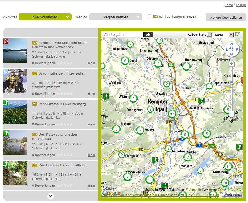
The latest post on the Google Lat Long Blog presents a neat new way to visualise big piles of data on a map. Pretty cool that they chose an example with bike trails to explain what can be done with Google Fusion Tables. The MTBGuru blog has more details along with maps and screenshots on their site. I think that we will give this a try at work and see if it may be an alternative to a more traditional clustering approach that we are using for visualising many thousand trails on a Google Map at the moment.
One problem I see with the approach of simply drawing all the tracks on a map is that there are many sections, where you will have overlapping tracks. Most of the tracks are GPS tracks that are not snapped to a network and you end up with tracks on top of tracks on top of tracks. A spaghetti trail map. If the trails were modelled as a network, then it would be cool though if you could just click on a part of the track network and have suggested tours come up that pass the section of the network you just clicked on.
